Monday, April 12, 2010

Photo Disect - Light Painting

This shot has been my most popular one on flickr, and generally gets people's attention because it's different to a 'normal' photo:


There's a few elements to the creation of this shot - and it's definitely a creation! Some of my favourite shots are just snaps or captures, but this one took some real effort.

My mate kez and I ventured to the pine forest between Brisbane and the Sunshine Coast to get some eerie shots of the trees. We got a few, but decided to try something cool while we were there - light painting the trees. Light painting is a method where a very long shutter speed is used, usually at least 15 seconds so tripod a necessity. During the exposure, parts of the photo are 'painted' with light - it can be done with a torch, flash or any light at all.

Trees look great when you introduce perspective to them - so I used my ultra wide sigma 10-20mm at its widest focal length - 10mm.

Because this photo covers such a vast area, I needed lots of power to paint the trees in, so i decided to paint with my speedlite flash 430EX II (see Accessories). I tested the ambient light with a few practice shots, to make sure that even though the trees were lit up, a bit of light could be seen in the sky and on the ground. I also tested the brightness of the flash at full power to see what aperture and ISO would be needed to show up the flash. I eventually settled on a shot in manual mode - around 1-2 minutes (depending on how long it took to paint in all the light), with a the widest aperture possible of f/4 at the relatively high ISO800. When using the finger button or self timer, modern DSLRs only take photos to about 30 seconds, but I was able to increase this past 30 seconds using my cable release (see Accessories).

All that was left was the painting! When light painting, it's very important to make sure the source of the light cant be seen in the photo, otherwise it will show up very obviously. I walked about 100 metres down the track, stopped, and then slowly started walking backwards. I illuminated the trees on either side with the flash set to 1/1 (full power) every few seconds, at about a 45 degree angle away from me. Once I was about 10 metres from the camera, I stopped, and unclicked my cable release, closing the shutter. This was the result straight off the camera:


Pretty cool I thought, but not amazing - the ground was a bit dark. We thought of trying to light paint the ground and the trees with another shot, but the flash was nearly melting already after being fired at full power so much, so we headed home.

There wasn't too much done in photoshop - I used a gradient/quick mask edit (will be posting tutorial for this soon) combined with levels to lighten the ground, evening it out with the rest of the photo. After that, I used levels to add contrast to the photo as a whole. I was already happy with the saturation as I had set it to +2 as part of my in-camera processing.

In the end, what makes this a good photo is the uniqueness of the idea behind it. Photographically, the composition is very simple, it's a little grainy and probably a bit too orange. This doesn't matter though, as most people wouldn't have seen anything like it before.

So have a go with light painting! Tripod and cable release are necessities, as you'll be looking to shoot 30 seconds+. To do this, you will need to shoot in Manual mode (don't be scared!) and roll the shutter speed past 30" - it should say 'BULB'. Have a play around with a few apertures and ISOs, and just switch the cable release on when you start painting, and switch it off when you stop. It's a good idea to go to www.flickr.com and search 'light painting' for some ideas and inspiration.

Good luck!

Cheers
Tal
Wednesday, April 7, 2010

Photo Disect - Gradient Map

After getting a few basics out of the way, gear, shooting and processing (see top right for those) - I'm going to be throwing up photos with explanations of the shooting technique and method.

This is my first one - my favourite shot from a trip to Canberra I had recently. I'm not normally prone to editing so much, and this one could nearly even be called more art than photography, but it's a great example of the use of the 'gradient map' tool:


It is a photo of the US Monument to Australia for WW1 (I think..), edited to represent the colours of the US: red, white and blue.

Here is the original shot:


We were cruising around canberra in a car towards sunset. In a car, I like to have a telephoto lens to capture things in the distance (anything close just ends up as a photo of a road or other cars) - so I had my 70-300. The 70-300 is a bit dodgy at apertures wider than about f/8, so I had it on Av mode at f/10 and ISO400 to ensure a fast shutter speed for the moving car. I also had the white balance set to 6000K (cloudy) to really boost the nice sunset colours. The camera here chose 1/1600 as the shutter speed.

I like the photo, but it's a bit too simple for me. I decided that either something cool should be done to it or to get rid of it. It's always worth a try!

Firstly I made it exactly straight and centred using a crop.
Then I decided on using a gradient map. A gradient map is a function which will convert certain parts of your photo to certain colours based on their brightness - whether they're a highlight, shadow, midtone or something in between (see levels for an explanation of these).

I opened gradient map tool (image -> adjustments -> gradient map) and clicked the colour gradient there to open up further options. Out of the 'presets' there, I chose one which featured three colours. I changed these to blue, red and white, meaning that the shadows in the photo (the right half of the statue) would be blue, the midtones (the sky/backdrop) would be red and the highlights (left half of the statue) would be white:


I had a play around with the square colour icons you can see at the bottom of the gradient there to get the colours exactly where I wanted. I also dropped the smoothness somewhat to increase contrast between the colours.

I hit 'ok', and the photo was saved and completed.

Have a play with the gradient tool function! If you find you've got an arty and simple composition but the photo just doesn't pop with natural colours, you might be able to find something interesting.

Cheers
Tal

Photoshop - Saturation

The simplest editing tool - basically just for saturation adjustments.

Find the 'Hue/Saturation' option in the menu. Ignore 'hue', and adjust saturation less or more to your liking. Don't overdo it either way!

Cheers
Tal

Processing - Photoshop Crop

Cropping, um, why do we need a page on this?

Because it's the easiest way to make a photo better! I've seen too many shots ruined by a distracting element on the edge of a photo that could have easily been cut out. In photography, simplicity is crucial - some good advice I've read when composing (or cropping) is that you should not think 'what can I fit in?' - you should think 'what can I leave out?'. The less there is in a photo, and the more well placed it is, the more impact it will have.
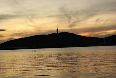
The most important part of cropping a photo, especially if it is a landscape or urban shot, is to level a horizon. Here's an example:


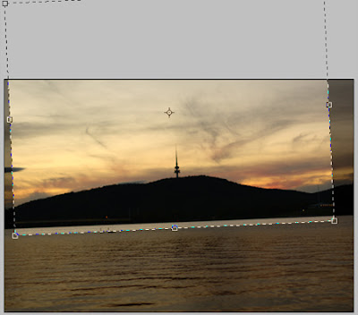
A decent shot, with some potential - but it's easy to see that the horizon is crooked. Lets fix it! Use the crop tool, found on the toolbar on left. As a rule I usually crop keeping my camera's 4272x2848 pixels, entered at the top. I like to do this to keep all my photos at the same ratio, which is best for prints. Others will do it differently. Anyway - back to the photo, the horizon needs to be levelled. Drag the crop across until you get decent width across the photo. Then hover your mouse across one of the bottom corners of the photo and you should see the mouse turn into a small rotation symbol. You can now rotate the crop to level with the horizon:


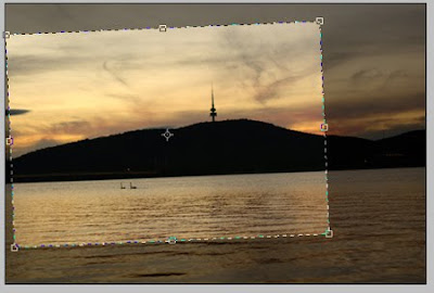
Once you have the crop levelled, you can choose the size and position of your new composition. It is good to have the interesting parts of the photo at the points where thirds of the photo intersect - known as the rule of thirds (http://en.wikipedia.org/wiki/Rule_of_thirds). So I will crop to this:


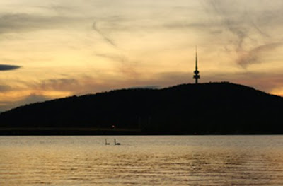
The tower is placed at the intersection of 2/3 to the right and 2/3 to the top of the photo - pleasing to the eye. Behold, a much better photo!:


Have a big play around with crops on photos that you take and see what pleases your eye. Remember, horizons level, less is more, rule of thirds, you can't go wrong!

Cheers
Tal

Processing - Photoshop

Photoshop!!!
Photoshop is simply brilliant. The amount of things you can do is endless, and in a year I still haven't learnt a tenth of them. I use Photoshop CS3, but Photoshop elements (so much cheaper) is fine for 90% of the rest. What I have learnt is a few simple tricks to getting a more professional shot:

Levels
Crop
Hue/Saturation
Gradient edits

The first three are very simple, the fourth a bit more advanced but a piece of cake once you get used to it, and an amazing way to edit.

Follow the links from the page on top right of the blog under 'Processing'.

Cheers
Tal

Processing - Photoshop Levels

Found in both CS and elements versions of Photoshop. I've always used levels! It's simple. and awesome. In CS3 this is image -> adjustments -> levels, and will look like this:


The histogram of the photo is shown, along with three slider wedges underneath that you can move. A histogram is a record of shadows, highlights and midtones within a photo. If you have a histogram heavy on the left (shadows), it will be quite dark. If it is heavy in the middle (lots of midtones), it should be exposed well, and if it is heavy on the right (highlights), it should be quite bright. Some people swear upon histograms for how good a photo is - but don't worry about it. If the photo looks good, it looks good!! You'll just need to understand the concept of shadows, midtones and highlights to use levels properly.

You can see the left wedge is black - for shadows, the middle one grey - for midtones and the right one is white - for highlights. I'll use a random photo off camera for an example of the effects of these:

The photo is decent, but a little bit dull. Levels will definitely improve it.

Moving the left wedge to the right will darken shadows - adding contrast. Here I have moved it to '20':

Moving the right wedge to the left will brighten highlights - making the bright parts stand out more. I have reset the photo to the original and then slid the highlights left to '235':


A simple levels adjustment is to darken shadows slightly, and lighten hightlights slightly. This gives a nice polished, professional look. BUT - DON'T OVERDO IT!! Otherwise you will turn into an indie.

Moving the middle wedge at times is important too. If you have under or over exposed, it is a great fixer:

Moving the middle wedge to the left will brighten midtones, an easy way to brighten a photo without making highlights over-expose.

Moving the middle wedge to the right will darken midtones, an easy way to darken a photo without sending shadows into oblivion.

When you lighten or darken midtones, the photo usually loses some contrast, so it's usually good to even them out - If I lighten midtones, I usually slightly darken shadows. If I darken midtones, I usually slightly lighten highlights.

My most common action in levels seems to be to brighten midtones slightly, and then darken shadows slightly. This seems to give a nice professional look. Try it for yourself!

Cheers
Tal

Processing - In Camera

There are a few simple settings in-camera on Digital SLRs that can be set to give you a more vibrant and professional shot straight off the camera.

On Canon DSLRs -> Find 'picture style' in the camera menu, enter it, and scroll down to see 'user def 1, user def 2, user def 3'. These are three in-camera processing settings that you can edit yourself. Scroll to user def 1, hit 'disp' and you will see 4 bars that you can edit. I have changed saturation to +2, and kept the other 3 bars the same. This gives a nicely saturated shot straight from the camera - the first step in a polished, professional looking shot.

On Nikon DSLRs (from kenrockwell.com, excellent website) -> Press MENU, select SHOOTING MENU (camera icon on left), go right (into the menu selections) and go down to the next page to SET PICTURE CONTROL, go right to the four standard options, and click two down to VIVID. This gives a nicer, more natural and professional result.

So there you go - a simple way to get better shots straight off camera. This has certainly helped me get shots that pop when I do event and sports photography - I dont have time to go through 100s of photos and edit them all, so this saves time and gives a great result.

You can have a play around with these settings - my user def 2 is a sepia high contrast edit and user def 3 is undersaturated+high contrasted for another cool effect. Check them out!


Cheers
Tal